Fontyou

About this project
Feature / Tool
Font manager
E-commerce
Duration
3,5 years
Role
UX/Ui lead
User researcher
Product Owner
Years
2013-2017
Context
In 2017, France opened its train market to external competition, prompting a visual update across all French train stations. The agency 4uatre conducted an initial audit and study for this revamp. I contributed as a UX/UI consultant, participating on interviews with train passengers and by creating the wireframes and designs for the new station panels.
The problem
Fontyou had built a font store for professionals, but it wasn’t working:
→ Complex credit-based payment model confused users
→ Poor UI contrast and visual hierarchy affected readability
->
90%
of designers face font licensing issues
“I can’t see how this font will look in my design. I don’t want to waste money.”
User feedback
+25
feedback tickets about users that couldn’t preview fonts properly
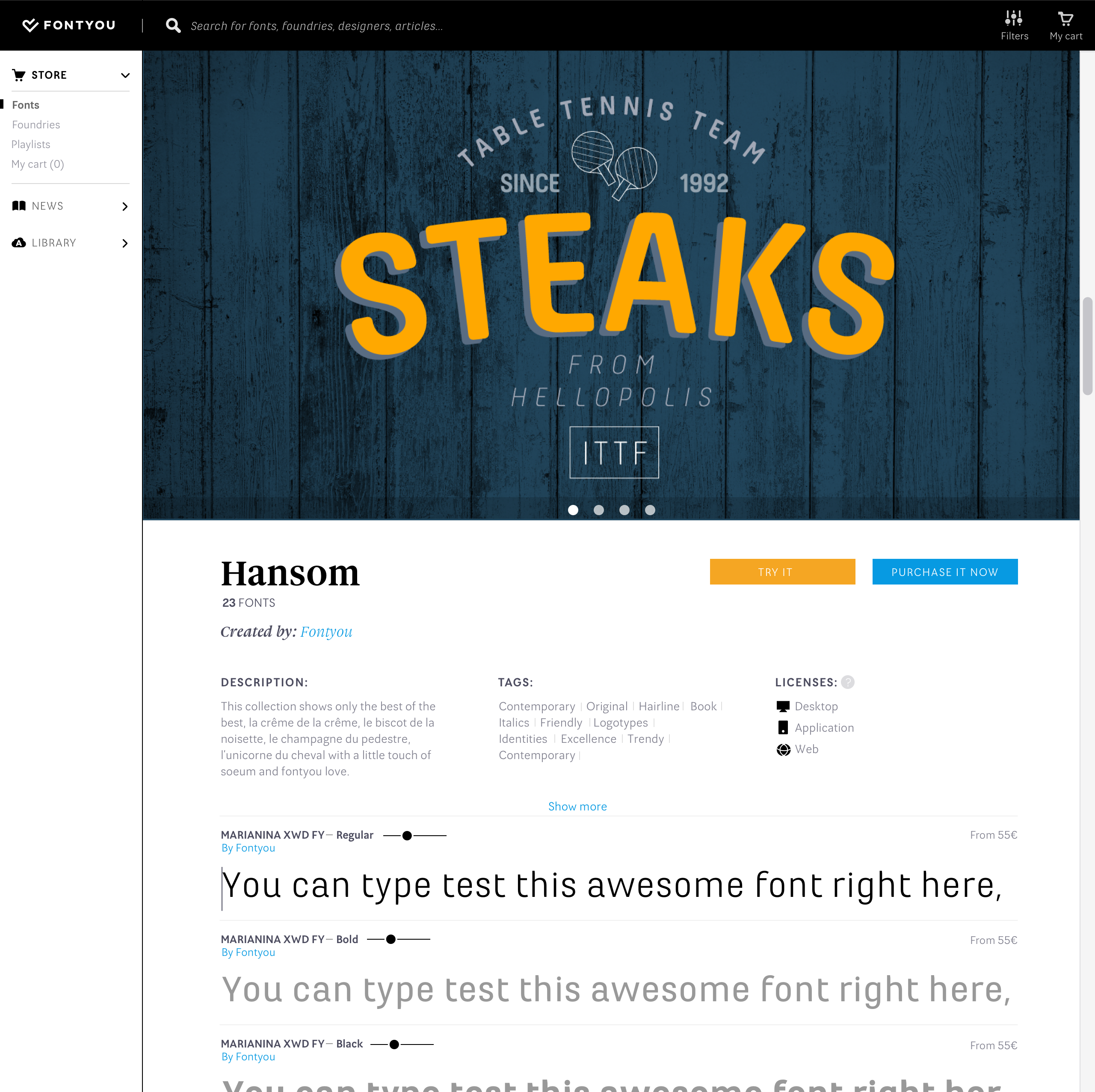
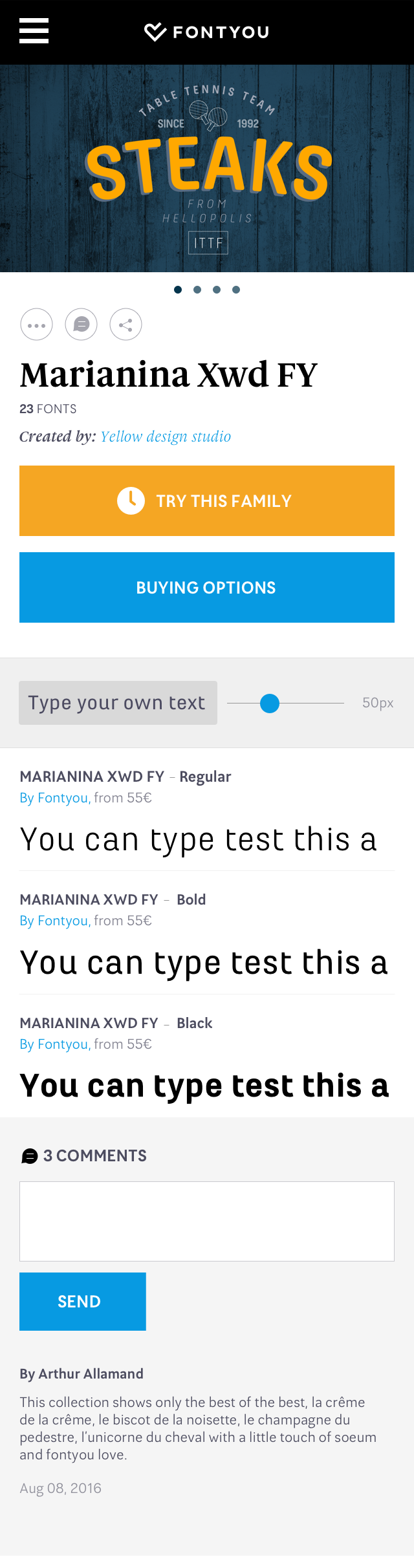
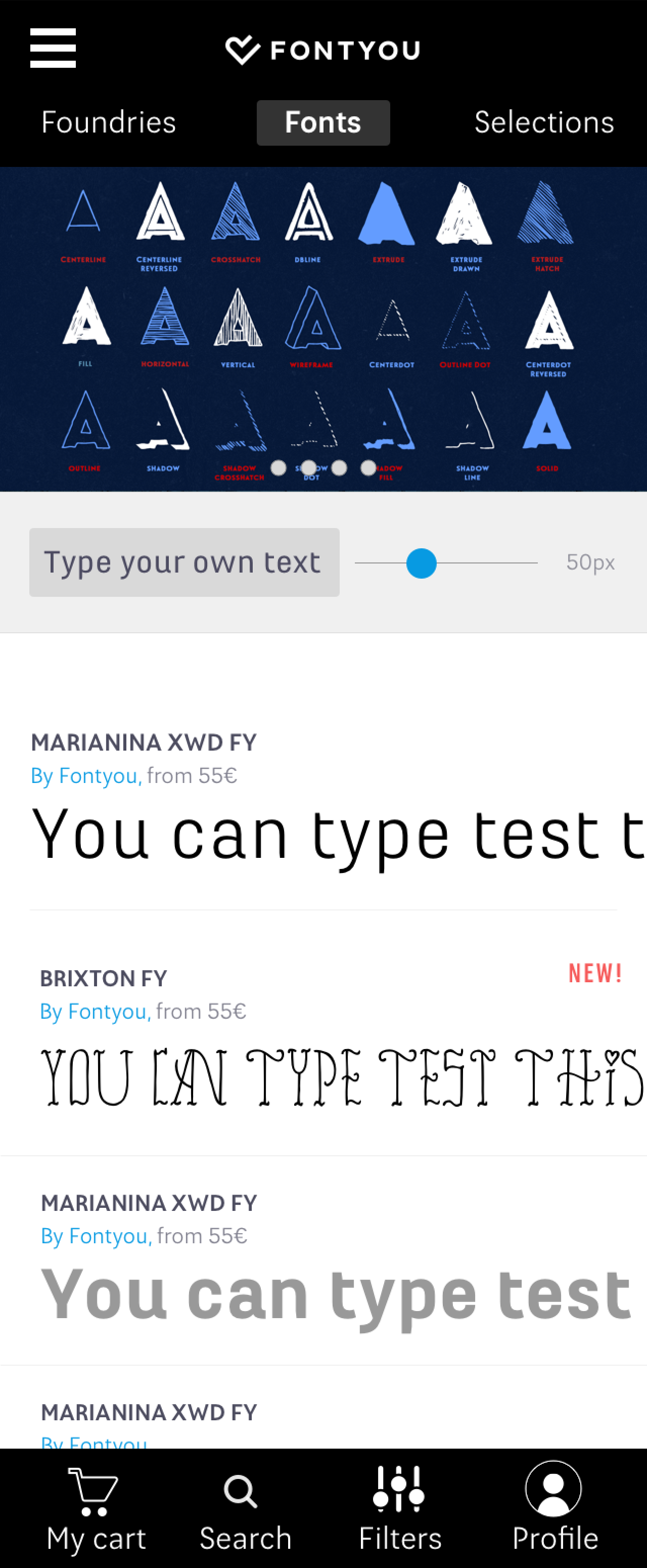
⚠️ This was the version of the product when I joined the company (2013)
How might we eliminate font workflow fragmentation between browsing, testing and managing type? #all-in-one font experience
Solutions
Through passenger interviews, we identified a clear priority for train information display:
- Destination (Primary focus)
- Departure Time
- Train Number
->This sequence aligns with passengers' natural boarding process—first confirming where and when, then checking train details.
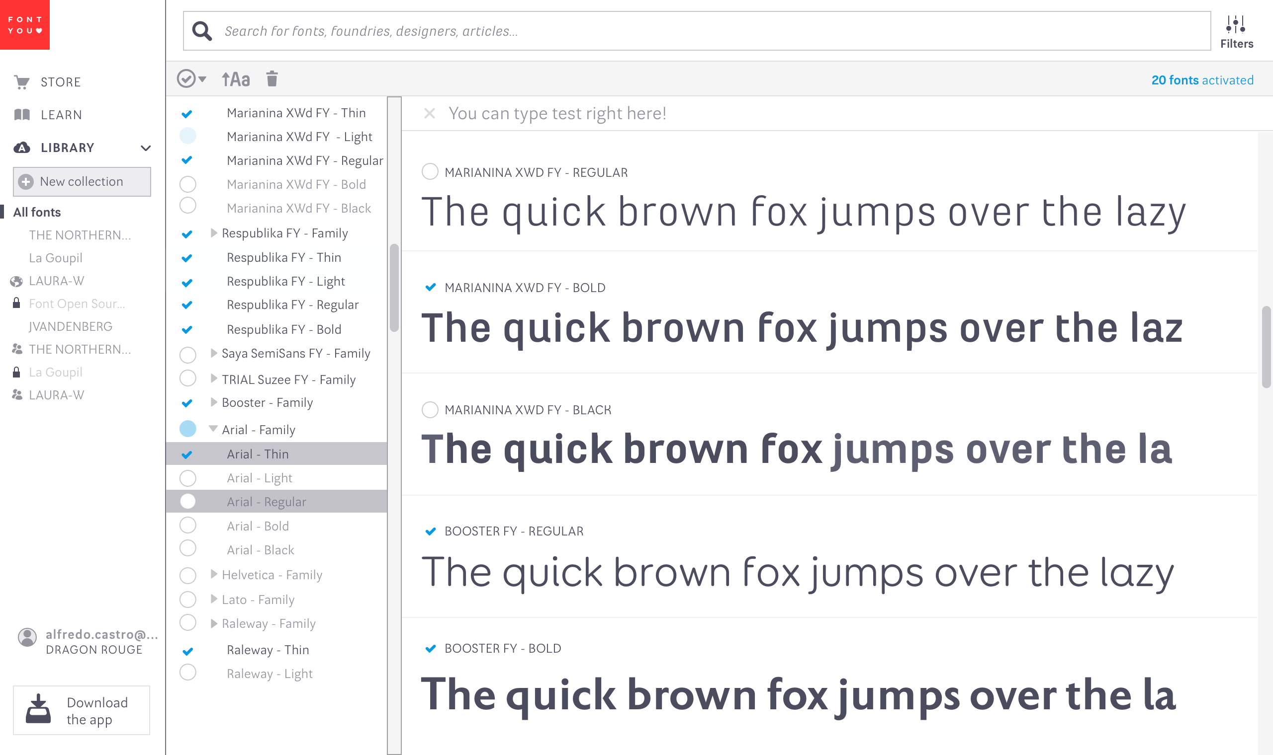
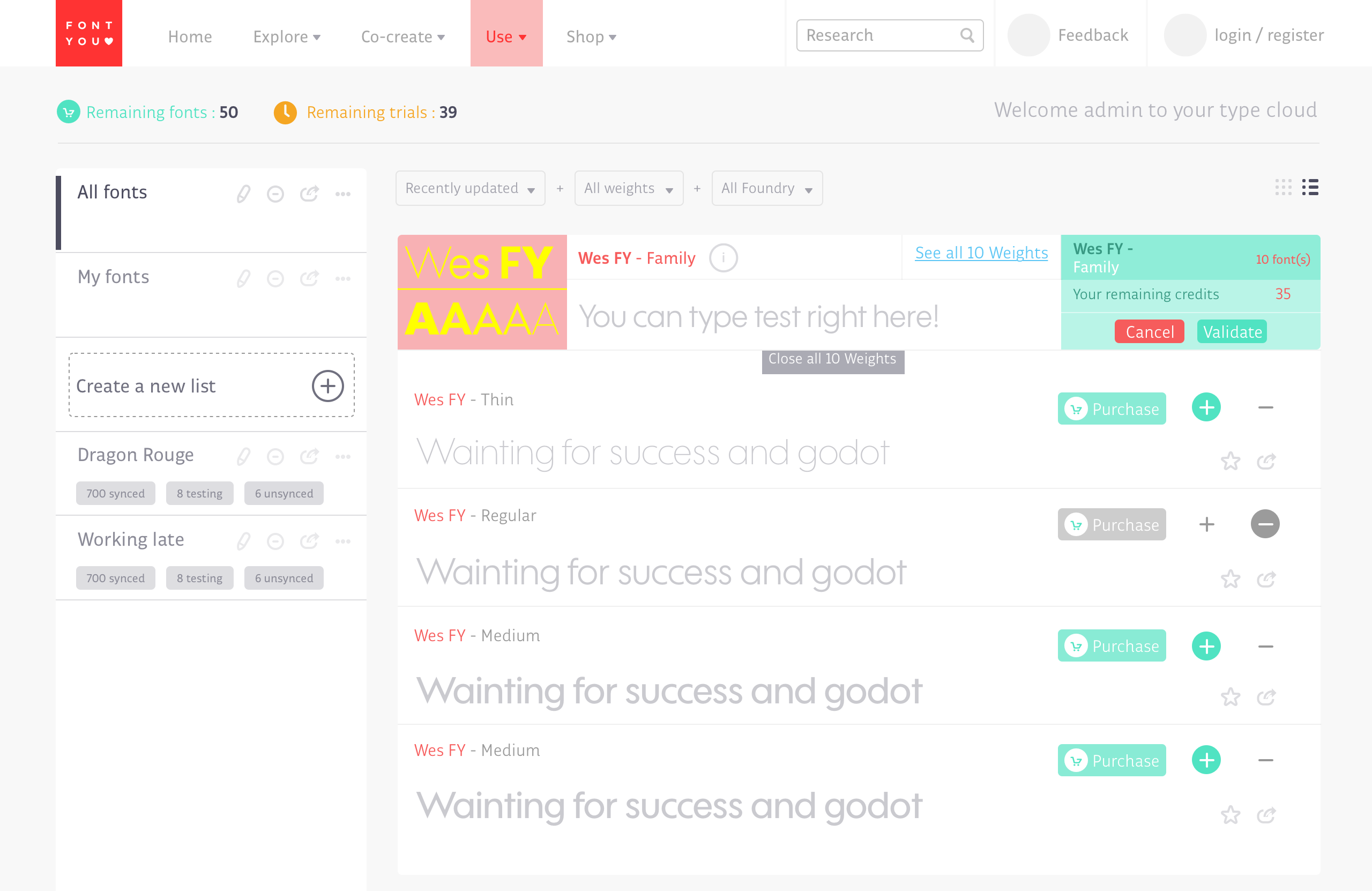
Library Page – Font Manager (2014)
Designed from scratch to help users organize and access thousands of fonts efficiently. The solution included:
- Smart categorization (auto-tagging by style, project, or frequency of use)
- Performance optimization for large libraries (fast previews, bulk actions)
- Cross-platform sync (seamless desktop/mobile access)
My first store version (2014). New architecture clearly featuring: The Store, The blog and the users Library.
->
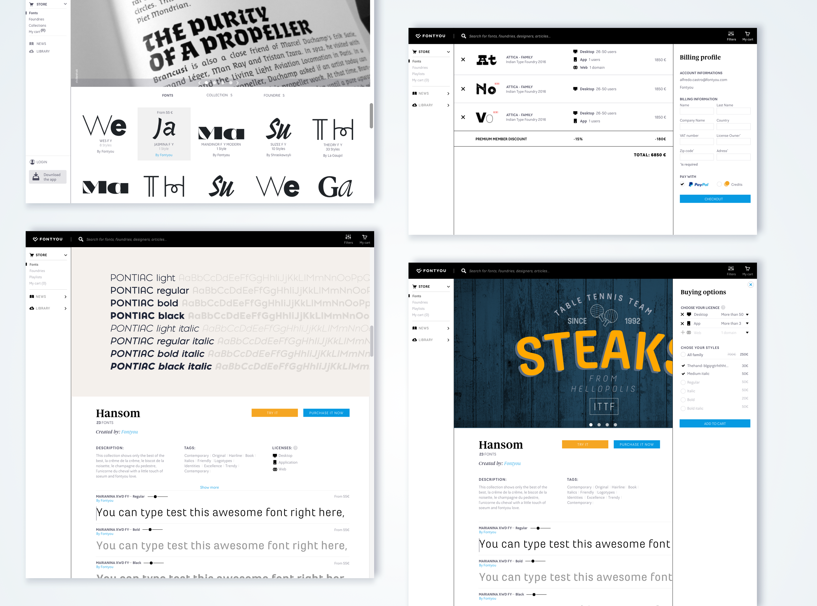
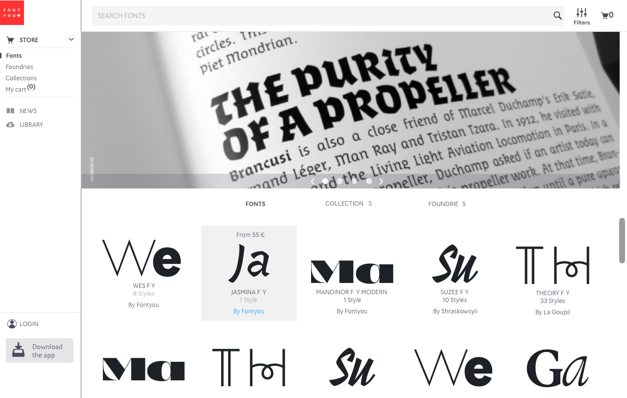
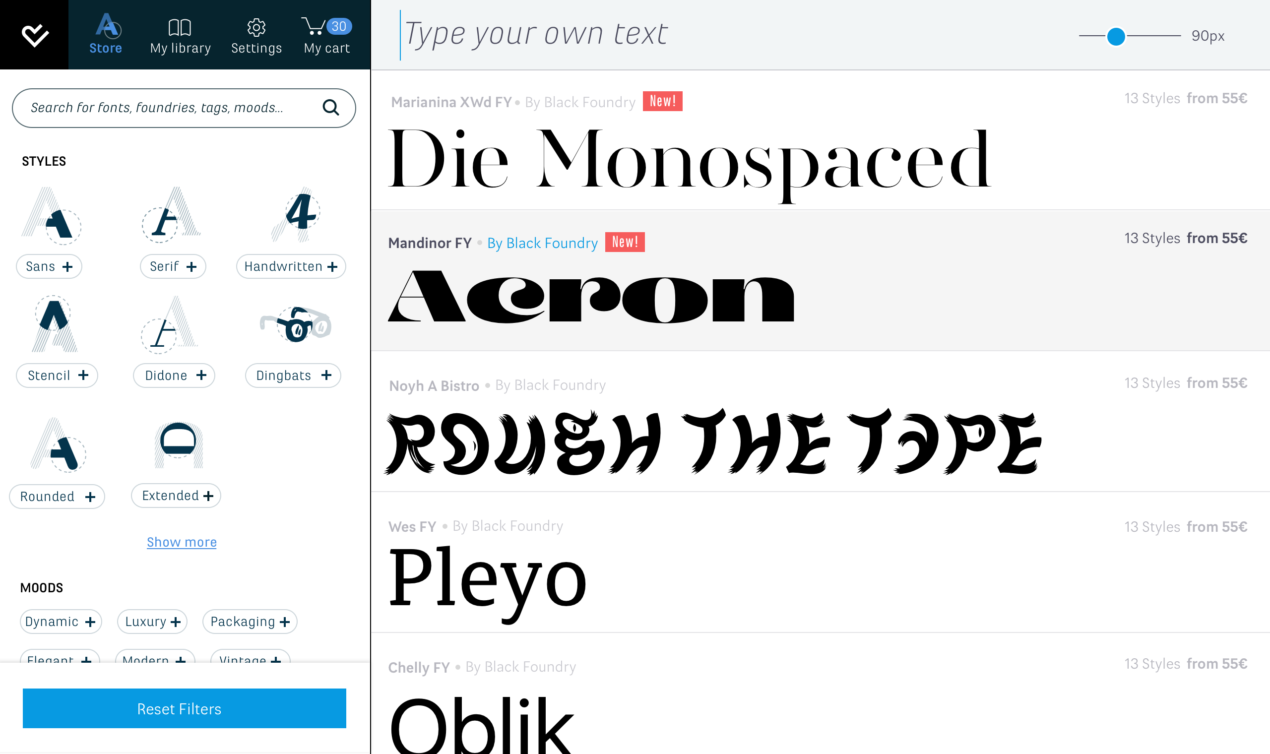
New Fontyou identity and UI revamp of the product included:
- Better and bigger specimen for the font families
- Brand new type-tester for the fonts on the store
- Clearer CTA’s and new cart flow
With this new version, we also released the mobile version of the platform.
Results
40%
faster font discovery
+12%
seller retention 6 months after the release.
2X
repeat purchases, 4 months after new version release
The last version of the platform I designed before the final closure of Fontyou due to the arrival of other actors like Google Fonts and Adobe.

Other Projects

See Project
→

See Project
→
Fontyou

About this project
Feature / Tool
Font manager
E-commerce
Duration
3,5 years
Role
UX/Ui lead
User researcher
Product Owner
Years
2013-2017
Context
In 2017, France opened its train market to external competition, prompting a visual update across all French train stations. The agency 4uatre conducted an initial audit and study for this revamp. I contributed as a UX/UI consultant, participating on interviews with train passengers and by creating the wireframes and designs for the new station panels.
The problem
Fontyou had built a font store for professionals, but it wasn’t working:
→ Complex credit-based payment model confused users
→ Poor UI contrast and visual hierarchy affected readability
->
90%
of designers face font licensing issues
“I can’t see how this font will look in my design. I don’t want to waste money.”
User feedback
+25
feedback tickets about users that couldn’t preview fonts properly
⚠️ This was the version of the product when I joined the company (2013)
How might we eliminate font workflow fragmentation between browsing, testing and managing type? #all-in-one font experience
Solutions
Through passenger interviews, we identified a clear priority for train information display:
- Destination (Primary focus)
- Departure Time
- Train Number
->This sequence aligns with passengers' natural boarding process—first confirming where and when, then checking train details.
Library Page – Font Manager (2014)
Designed from scratch to help users organize and access thousands of fonts efficiently. The solution included:
- Smart categorization (auto-tagging by style, project, or frequency of use)
- Performance optimization for large libraries (fast previews, bulk actions)
- Cross-platform sync (seamless desktop/mobile access)
My first store version (2014). New architecture clearly featuring: The Store, The blog and the users Library.
->
New Fontyou identity and UI revamp of the product included:
- Better and bigger specimen for the font families
- Brand new type-tester for the fonts on the store
- Clearer CTA’s and new cart flow
With this new version, we also released the mobile version of the platform.
Results
40%
faster font discovery
+12%
seller retention 6 months after the release.
2X
repeat purchases, 4 months after new version release
The last version of the platform I designed before the final closure of Fontyou due to the arrival of other actors like Google Fonts and Adobe.

Other Projects
See Project
→
See Project
→
Fontyou

About this project
Feature / Tool
Font manager
E-commerce
Duration
3,5 years
Role
UX/Ui lead
User researcher
Product Owner
Years
2013-2017
Context
Fontyou began as a collaborative foundry, pivoted to a font manager with global partnerships, then closed in 2017 amid industry shifts. As a startup Swiss Army knife (PM, UX/UI, frontend), I discovered my passion for digital products here. This was my crash course in building and adapting products—lessons that still guide me today.
The problem
Fontyou had built a font store for professionals, but it wasn’t working:
→ Complex credit-based payment model confused users
→ Poor UI contrast and visual hierarchy affected readability
→ Weak product–market fit in a niche, oversaturated market
90%
of designers face font licensing issues
“I can’t see how this font will look in my design. I don’t want to waste money.”
User feedback
+25
feedback tickets about users that couldn’t preview fonts properly
⚠️ This was the version of the product when I joined the company (2013)
How might we eliminate font workflow fragmentation between browsing, testing and managing type? #all-in-one font experience
Solutions
→ Defined marketplace UX patterns
→ Established trust systems for digital assets
→ Shipped core flows (search, licensing, payments)
My first version (2014). New architecture clearly featuring: The Store, The blog and the users Library.
→ this is the store page
Library Page – Font Manager (2014)
Designed from scratch to help users organize and access thousands of fonts efficiently. The solution included:
- Smart categorization (auto-tagging by style, project, or frequency of use)
- Performance optimization for large libraries (fast previews, bulk actions)
- Cross-platform sync (seamless desktop/mobile access)
New Fontyou identity and UI revamp of the product included:
- Better and bigger specimen for the font families
- Brand new type-tester for the fonts on the store
- Clearer CTA’s and new cart flow
With this new version, we also released the mobile version of the platform.
Results
40%
faster font discovery
+12%
seller retention 6 months after the release.
2X
repeat purchases, 4 months after new version release
The last version of the platform I designed before the final closure of Fontyou due to the arrival of other actors like Google Fonts and Adobe.

Other Projects
See Project
→
See Project
→