Contentsquare Navigation Redesign

About this project
Feature / Tool
Global navigation system redesign
Learn more
→
Duration
5 months
Role
Principal Product Designer, UX architecture, OOUX, stakeholder alignment
Years
2022
Context
Back in 2022, Contentsquare was known as a powerful analytics platform — but also as a complex one.Many customers found it difficult to use without expert guidance from Customer Success.
→ This complexity directly impacted adoption and churn.→ Upselling new products was challenging because the value of the platform wasn’t immediately clear.
“The product is very difficult tu use”
“I don’t know where to start to make a proper analysis.”
“It takes too long to do the analyses we need.”
Each module behaved like an independent product.Users struggled to see how everything connected, resulting in fragmented workflows and lost insights.
The problem
The company’s biggest target for 2022 was simplification — making Contentsquare easier to use, without reducing its analytical power.
The Product Design team was asked by the CPO to rethink how users navigate the platform while keeping internal structures intact.
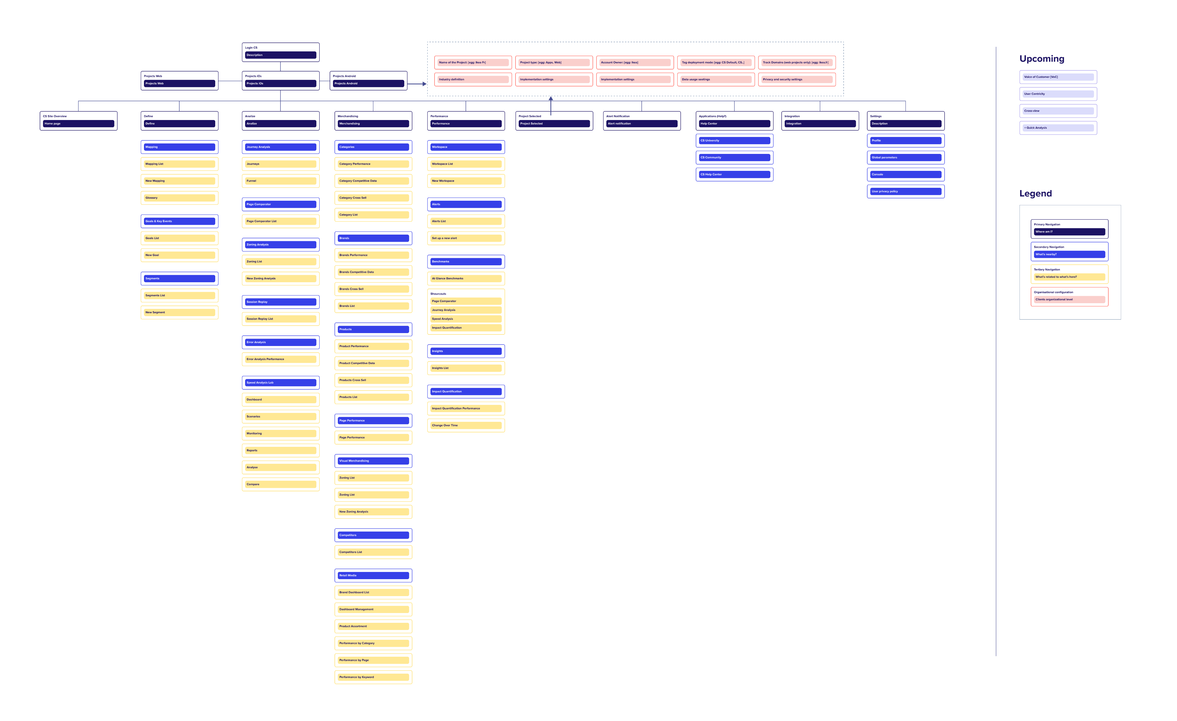
⚠️ This was the past version of the navigation header. Four main entry points but impossible to understand where to start and why.

10
per 100 accounts
Low weekly active users
4 min
Average time-to-first-value (time spend in between first click on the platform and first KPI value displayed)
55%
Churn rate among single-module users
How might we make Contentsquare more understandable without disrupting existing teams and systems?
Solution
Design POC (Proof Of Concept) initiative
→ A conceptual exploration aimed to align stakeholders around a new vision for product simplification.→ It wasn’t meant for immediate development but to serve as a strategic conversation starter.
💡 Why the navigation is critical for simplifying the product?
→ “The navigation defines how users think about our product. If it’s fragmented, their experience will be too.”
→ By addressing navigation first, we could rebuild the product’s mental model and unify multiple modules into one seamless ecosystem.
Design Foundations
- Starting Point map
I mapped the full architecture in order to have a macro view of the product.
This map clarified how the product was built, but it didn’t provide insight into how it is being used.
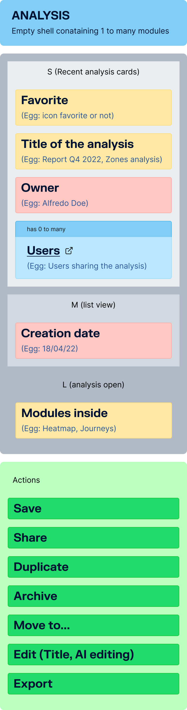
- OOUX mapping
I decided to use the Object-Oriented UX (OOUX) methodology to map every entity across the product:
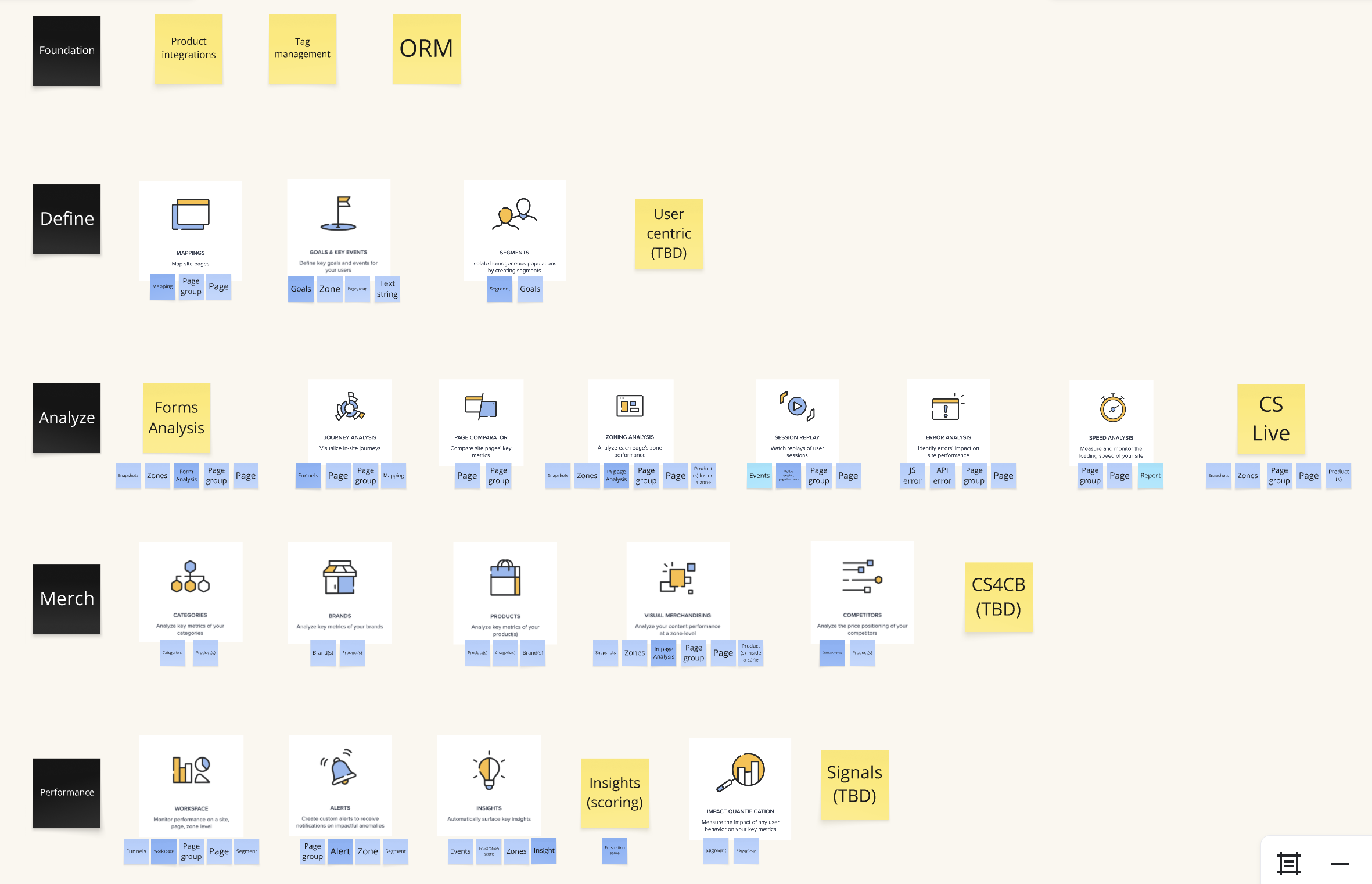
This clarified relationships, identified redundancies, and explained how Customer Support intends for our users to utilize the product.
- Laboratory Concept foundation
I reimagined Contentsquare as a lab where various analyses can be conducted:
Each module is a “station” that performs a specific analysis.
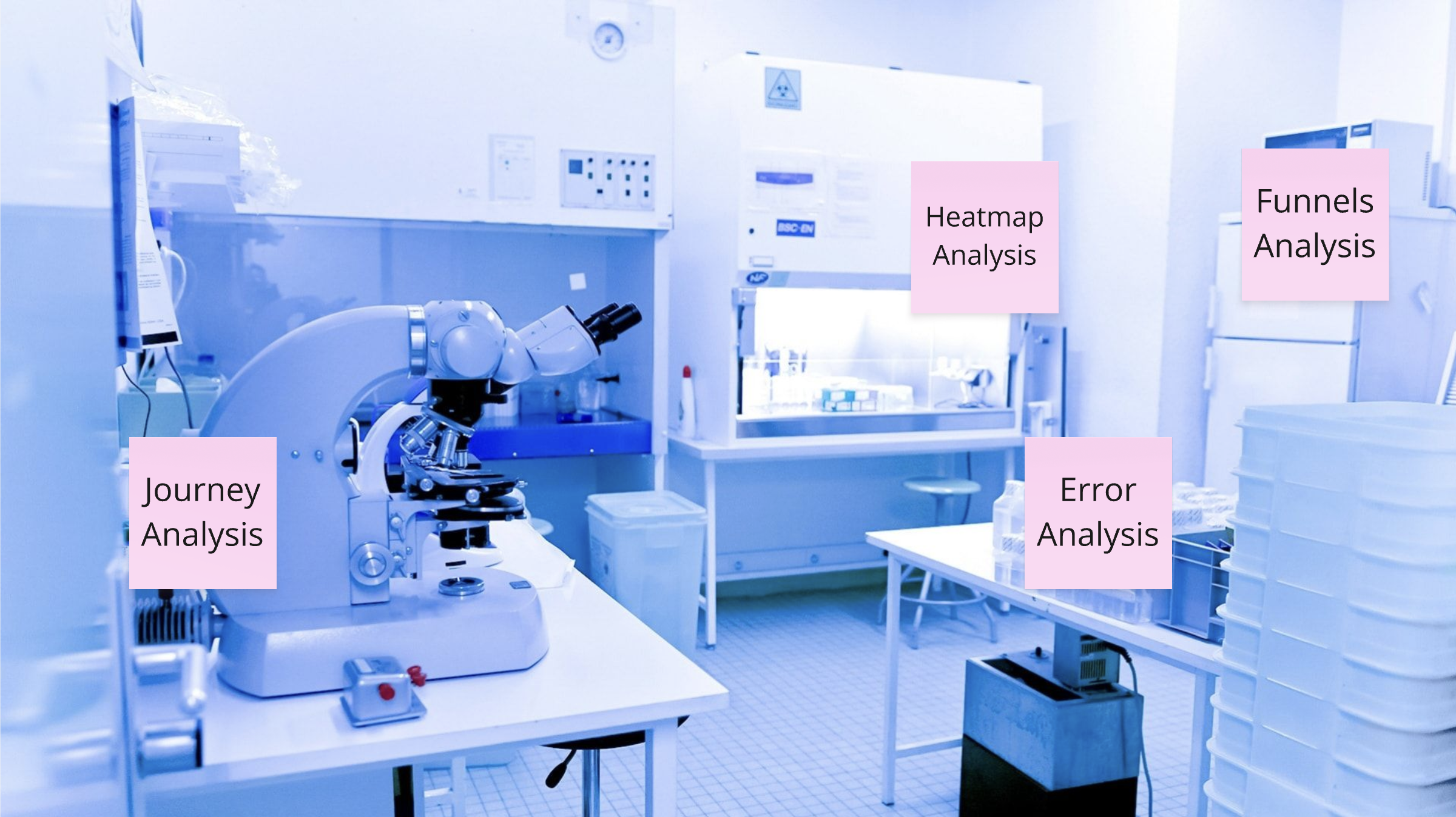
The data objects (zones, pages, goals) move between stations to generate insights.
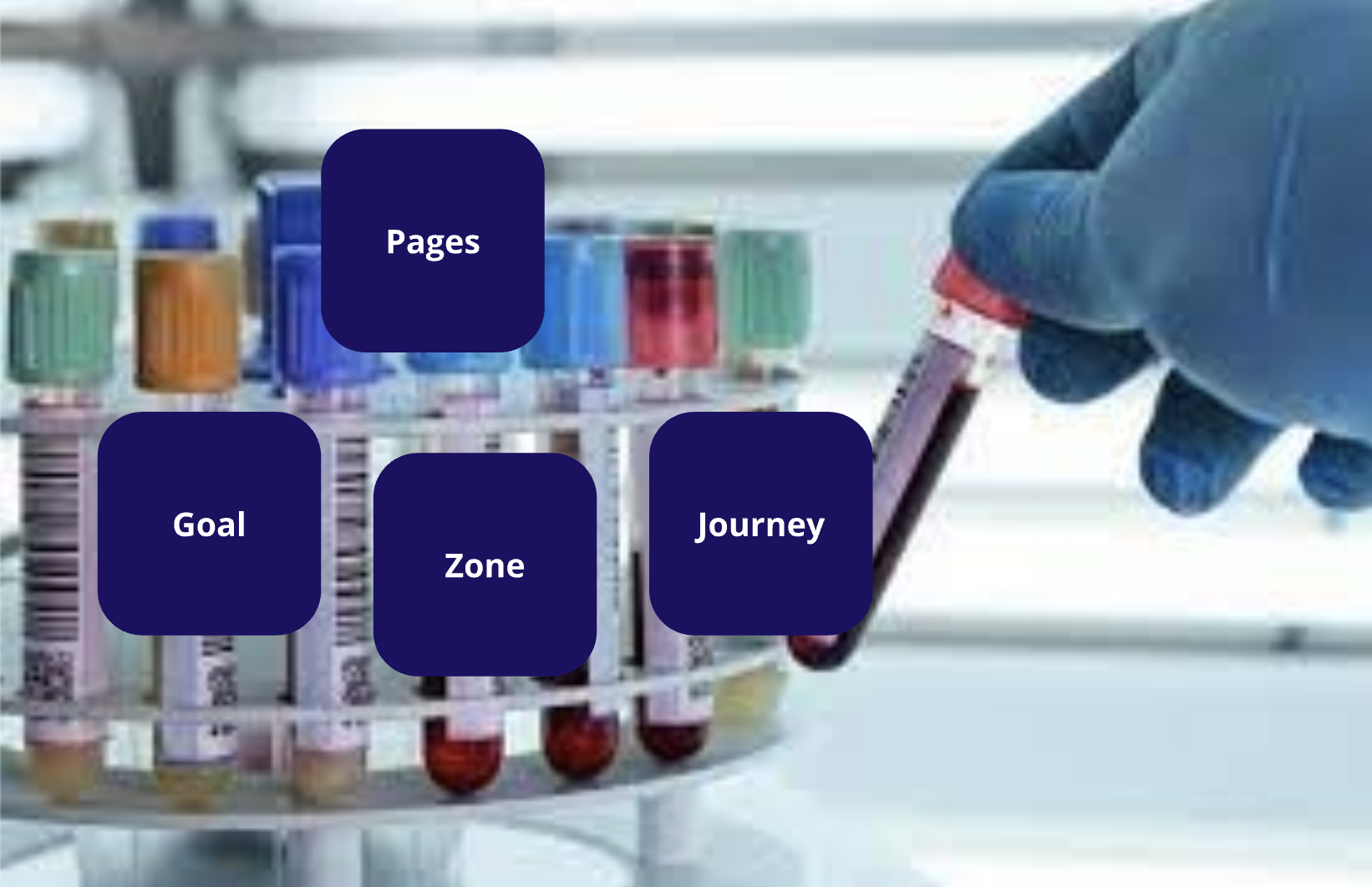
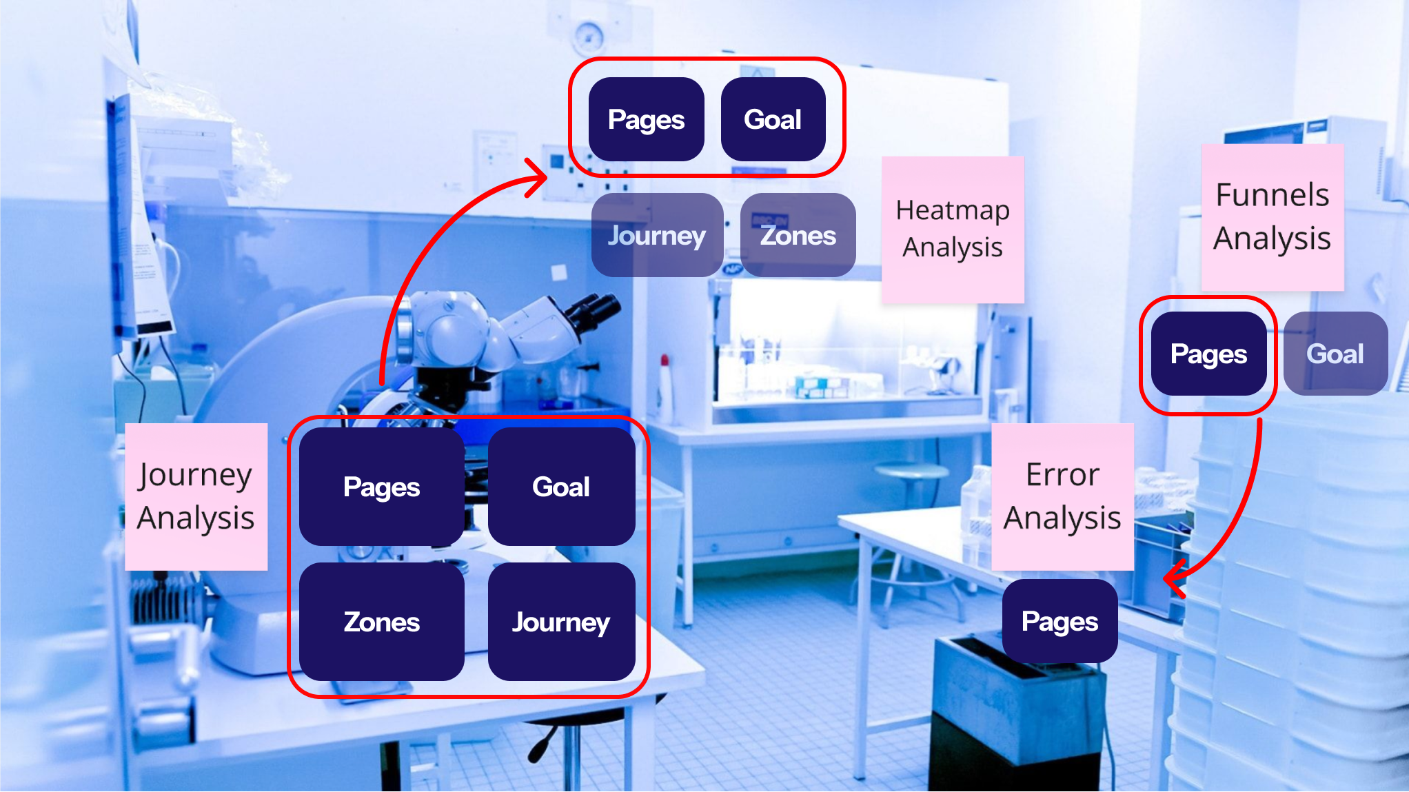
This metaphor helped teams visualize how modules could interoperate — turning a collection of tools into a connected analytical environment.
- Strategic assumptions
These foundations helped me establish assumptions that will drive my conceptions
- Unify modules to enable intuitive combinations.
- Clarify use cases to anchor navigation in real-world goals: monitor, compare, report.
- Empower users through immediate value discovery.
Conception
- Unifying modules:
Initially, I aimed to discover a method for integrating modules, allowing users to utilize multiple modules within a single analysis.
Using the OOUX methodology I created a new object called “Analysis”. This object is ideated as an empty shell that can contain 1 to many modules on the same analysis.
- Reshaping the architecture
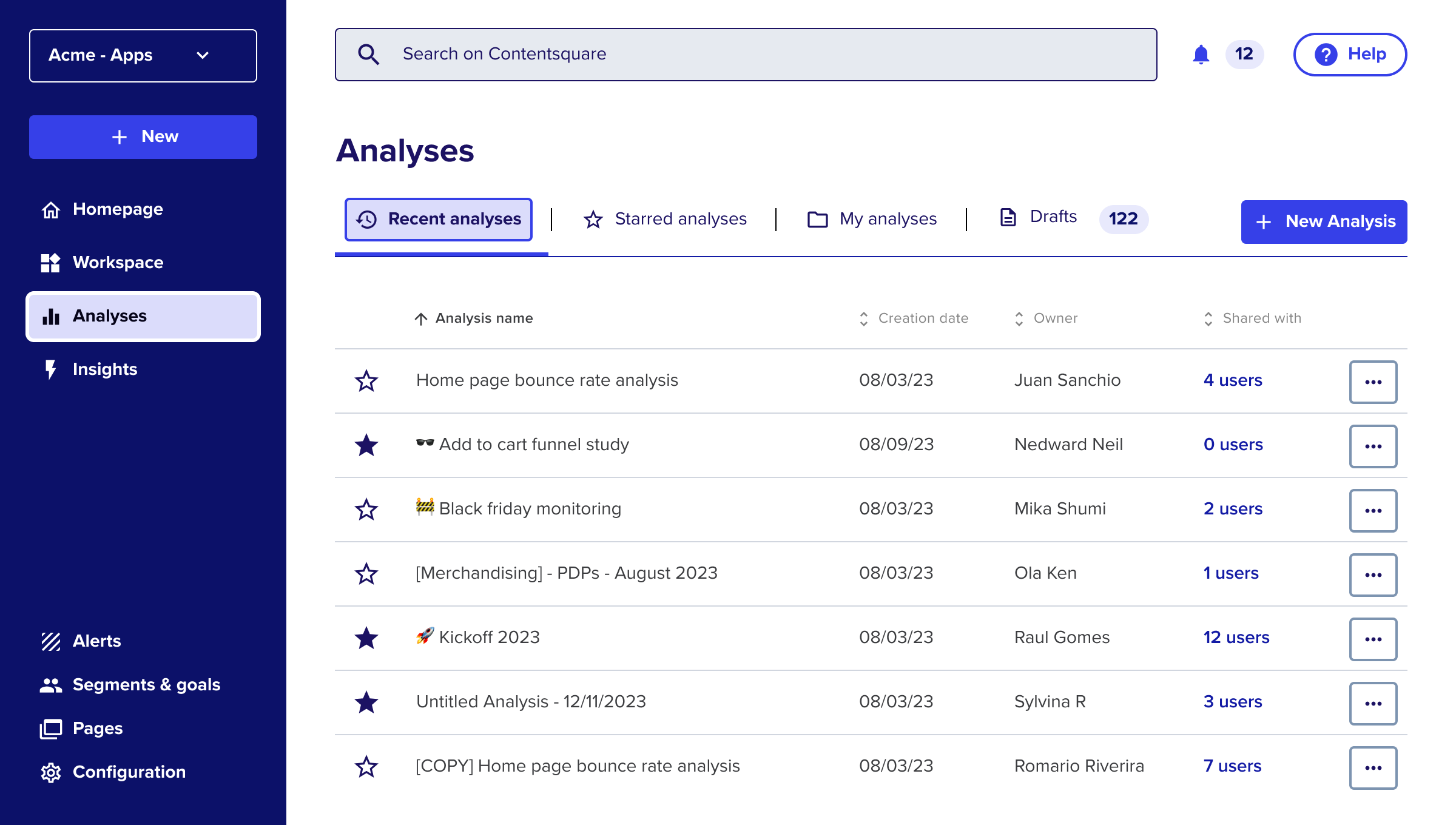
Once the modules unified, it was easier to shape the architecture of the rest of the platform, following a OOUX navigation system.
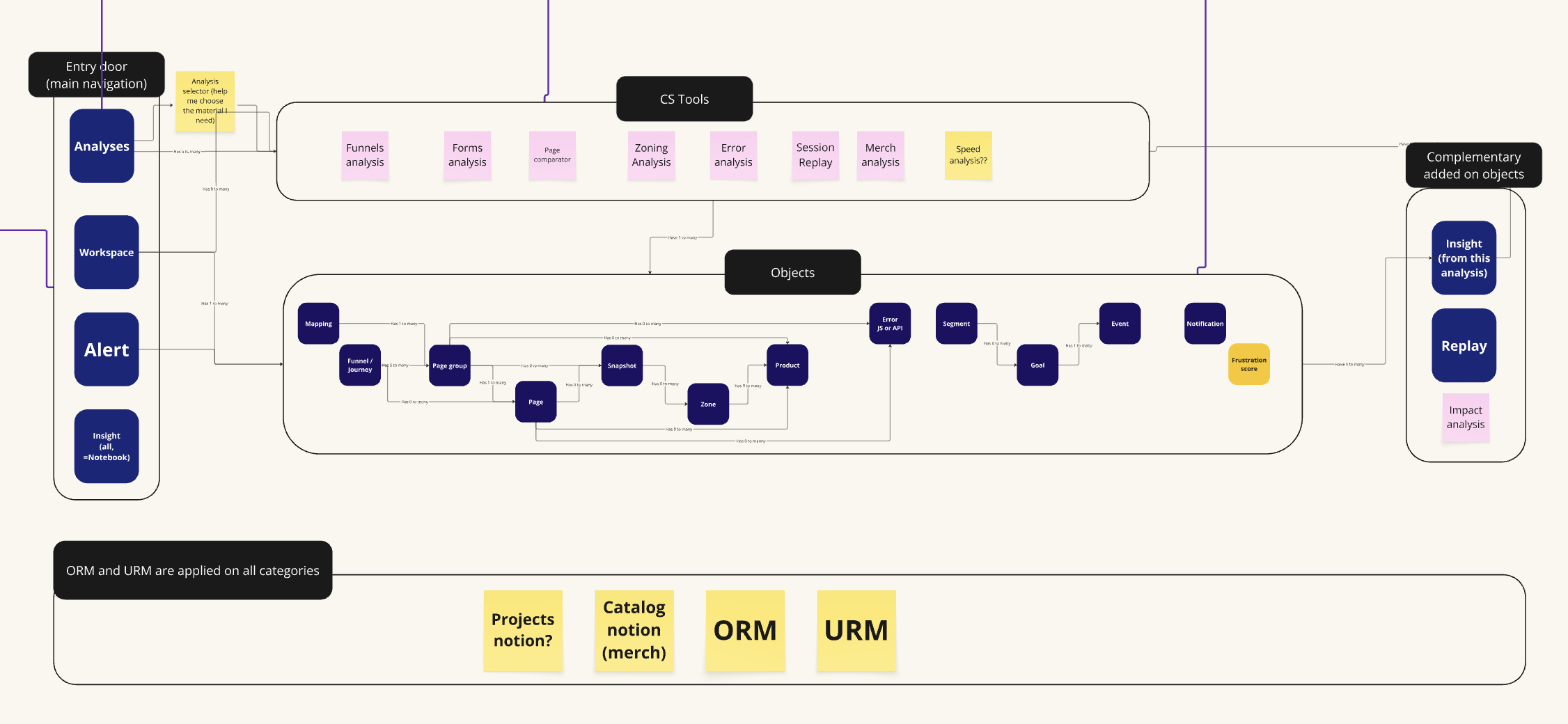
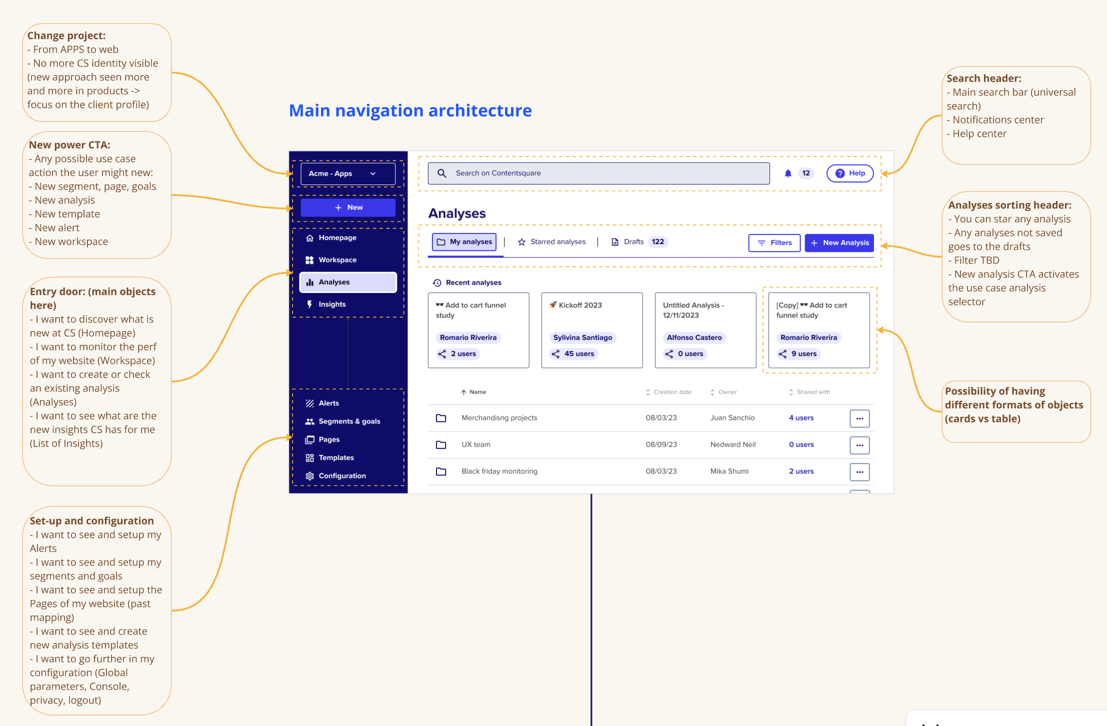
- Reshaping the architecture
Once the modules unified, it was easier to shape the architecture of the rest of the platform, following a OOUX navigation system.
Results
Before:
❌ Fragmented modules with no clear hierarchy ❌ Users needed to “guess” which tool to use ❌ Heavy reliance on CSM onboarding

After:
✅ Unified navigation built around user goals ✅ Simplified entry points and faster discovery ✅ Framework ready for AI-driven expansion
Impact of this project:
Even as a POC, this initiative influenced the 2023 product roadmap and became the foundation for the next generation of Contentsquare’s experience:
- Redefined “Analysis” as the core entry point
- Simplified mental models across modules
- Creation of a new unit focus on rebuilding the CS navigation
“Simplification isn’t about removing complexity → it’s about revealing structure.”

Other Projects

See Project
→

See Project
→
Contentsquare Navigation Redesign

About this project
Feature / Tool
Global navigation system redesign
Learn more
→
Duration
5 months
Role
Principal Product Designer, UX architecture, OOUX, stakeholder alignment
Years
2022
Context
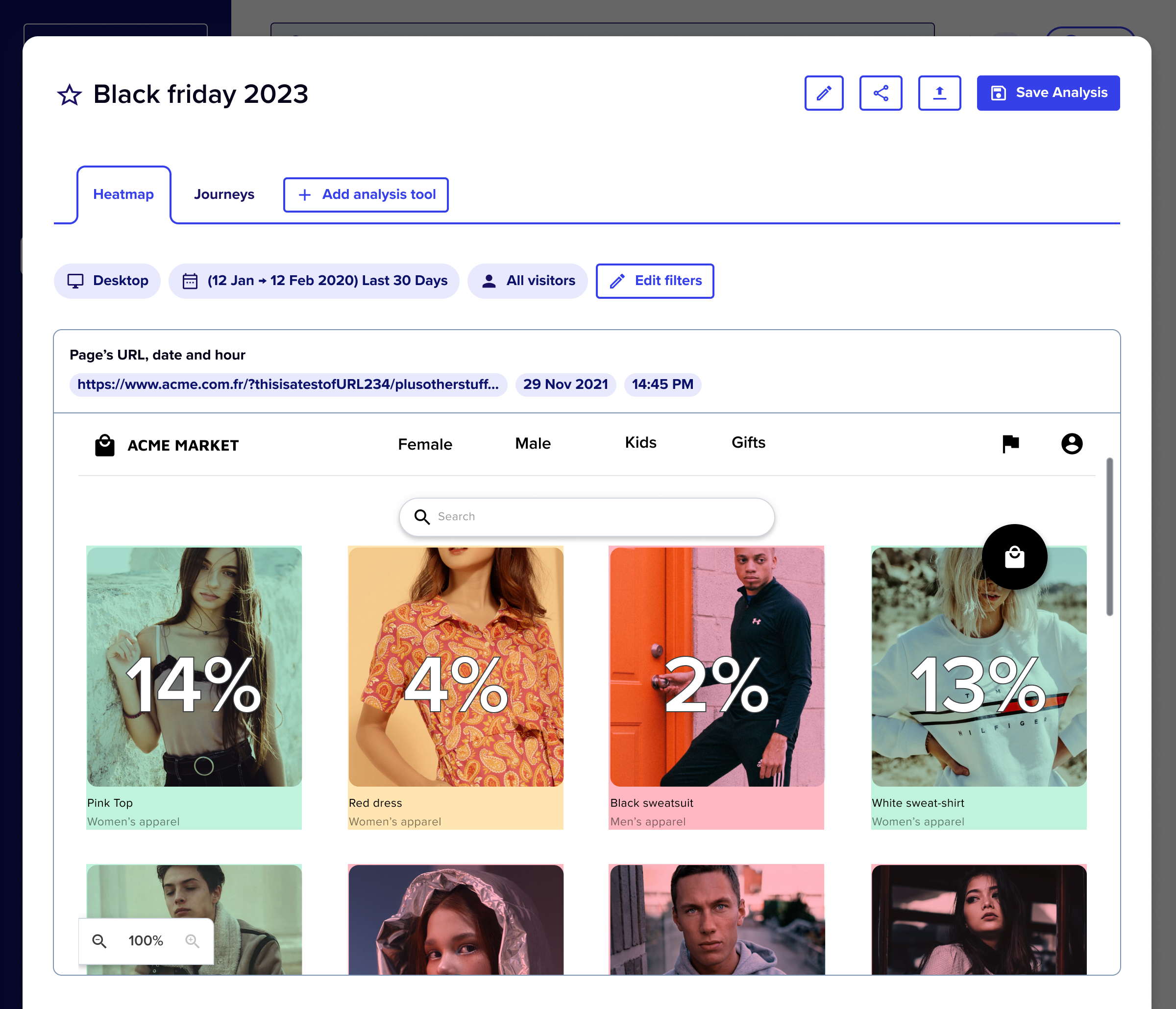
Heatmap Analysis is Contentsquare’s most critical tool (used by 55% of users exclusively) allowed customers to:
→ Highlight webpage elements (e.g., <DIV>)
→ Overlay metrics (e.g., conversion rates) for insights
“The product is very difficult tu use”
“I don’t know where to start to make a proper analysis.”
“It takes too long to do the analyses we need.”
The problem
The company’s biggest target for 2022 was simplification — making Contentsquare easier to use, without reducing its analytical power.
The Product Design team was asked by the CPO to rethink how users navigate the platform while keeping internal structures intact.
⚠️ This was the past version of the navigation header. Four main entry points but impossible to understand where to start and why.
10
per 100 accounts
Low weekly active users
4 min
Average time-to-first-value (time spend in between first click on the platform and first KPI value displayed)
55%
Churn rate among single-module users
How might we make Contentsquare more understandable without disrupting existing teams and systems?
Solution
Design POC (Proof Of Concept) initiative
→ A conceptual exploration aimed to align stakeholders around a new vision for product simplification.→ It wasn’t meant for immediate development but to serve as a strategic conversation starter.
💡 Why the navigation is critical for simplifying the product?
→ “The navigation defines how users think about our product. If it’s fragmented, their experience will be too.”
→ By addressing navigation first, we could rebuild the product’s mental model and unify multiple modules into one seamless ecosystem.
Design Foundations
- Starting Point map
I mapped the full architecture in order to have a macro view of the product.
This map clarified how the product was built, but it didn’t provide insight into how it is being used.
- OOUX mapping
I decided to use the Object-Oriented UX (OOUX) methodology to map every entity across the product:
This clarified relationships, identified redundancies, and explained how Customer Support intends for our users to utilize the product.
- Laboratory Concept foundation
I reimagined Contentsquare as a lab where various analyses can be conducted:
Each module is a “station” that performs a specific analysis.
The data objects (zones, pages, goals) move between stations to generate insights.
This metaphor helped teams visualize how modules could interoperate — turning a collection of tools into a connected analytical environment.
- Strategic assumptions
These foundations helped me establish assumptions that will drive my conceptions
- Unify modules to enable intuitive combinations.
- Clarify use cases to anchor navigation in real-world goals: monitor, compare, report.
- Empower users through immediate value discovery.
Conception
- Unifying modules:
Initially, I aimed to discover a method for integrating modules, allowing users to utilize multiple modules within a single analysis.
Using the OOUX methodology I created a new object called “Analysis”. This object is ideated as an empty shell that can contain 1 to many modules on the same analysis.
- Reshaping the architecture
Once the modules unified, it was easier to shape the architecture of the rest of the platform, following a OOUX navigation system.
- Reshaping the architecture
Once the modules unified, it was easier to shape the architecture of the rest of the platform, following a OOUX navigation system.
Results
Before:
❌ Fragmented modules with no clear hierarchy ❌ Users needed to “guess” which tool to use ❌ Heavy reliance on CSM onboarding
After:
✅ Unified navigation built around user goals ✅ Simplified entry points and faster discovery ✅ Framework ready for AI-driven expansion
Impact of this project:
Even as a POC, this initiative influenced the 2023 product roadmap and became the foundation for the next generation of Contentsquare’s experience:
- Redefined “Analysis” as the core entry point
- Simplified mental models across modules
- Creation of a new unit focus on rebuilding the CS navigation
“Simplification isn’t about removing complexity → it’s about revealing structure.”

Other Projects
See Project
→
See Project
→
Contentsquare Navigation Redesign

About this project
Feature / Tool
Global navigation system redesign
Learn more
→
Duration
5 months
Role
Principal Product Designer, UX architecture, OOUX, stakeholder alignment
Years
2022
Context
Back in 2022, Contentsquare was known as a powerful analytics platform — but also as a complex one.Many customers found it difficult to use without expert guidance from Customer Success.
→ This complexity directly impacted adoption and churn.→ Upselling new products was challenging because the value of the platform wasn’t immediately clear.
“The product is very difficult tu use”
“I don’t know where to start to make a proper analysis.”
“It takes too long to do the analyses we need.”
Each module behaved like an independent product.Users struggled to see how everything connected, resulting in fragmented workflows and lost insights.
The problem
The company’s biggest target for 2022 was simplification
The Product Design team was asked by the CPO to rethink how users navigate the platform while keeping internal structures intact.
→ The goal: making Contentsquare easier to use, without reducing its analytical power.
⚠️ This was the past version of the navigation header. Four main entry points but impossible to understand where to start and why.
10
per 100 accounts
Low weekly active users
4 min
Average time-to-first-value (time spend in between first click on the platform and first KPI value displayed)
55%
Churn rate among single-module users
How might we make Contentsquare more understandable without disrupting existing teams and systems?
Solution
Design POC (Proof Of Concept) initiative
→ A conceptual exploration aimed to align stakeholders around a new vision for product simplification.→ It wasn’t meant for immediate development but to serve as a strategic conversation starter.
💡 Why the navigation is critical for simplifying the product?
→ “The navigation defines how users think about our product. If it’s fragmented, their experience will be too.”
→ By addressing navigation first, we could rebuild the product’s mental model and unify multiple modules into one seamless ecosystem.
Design Foundations
- Starting Point map
I mapped the full architecture in order to have a macro view of the product.
This map clarified how the product was built, but it didn’t provide insight into how it is being used.
- OOUX mapping
I decided to use the Object-Oriented UX (OOUX) methodology to map every entity across the product:
This clarified relationships, identified redundancies, and explained how Contentsquare intends for our users to utilize the product.
- Laboratory Concept foundation
I reimagined Contentsquare as a lab where various analyses can be conducted:
Each module is a “station” that performs a specific analysis.
The data objects (zones, pages, goals) move between stations to generate insights.
This metaphor helped teams visualize how modules could interoperate — turning a collection of tools into a connected analytical environment.
- Strategic assumptions
These foundations allowed me to form assumptions that will guide my ideas.
- Unify modules to enable intuitive combinations.
- Clarify use cases to anchor navigation in real-world goals: monitor, compare, report.
- Empower users through immediate value discovery.
Conception
- Unifying modules:
Initially, I aimed to discover a method for integrating modules, allowing users to utilize multiple modules within a single analysis.
→ I utilized the OOUX methodology to develop a new object named "Analysis." This object is designed as a flexible framework that can hold one or more modules related to the same analysis.
- Reshaping the architecture
Once the modules were unified, it became easier to design the architecture of the rest of the platform, adhering to an OOUX navigation system.
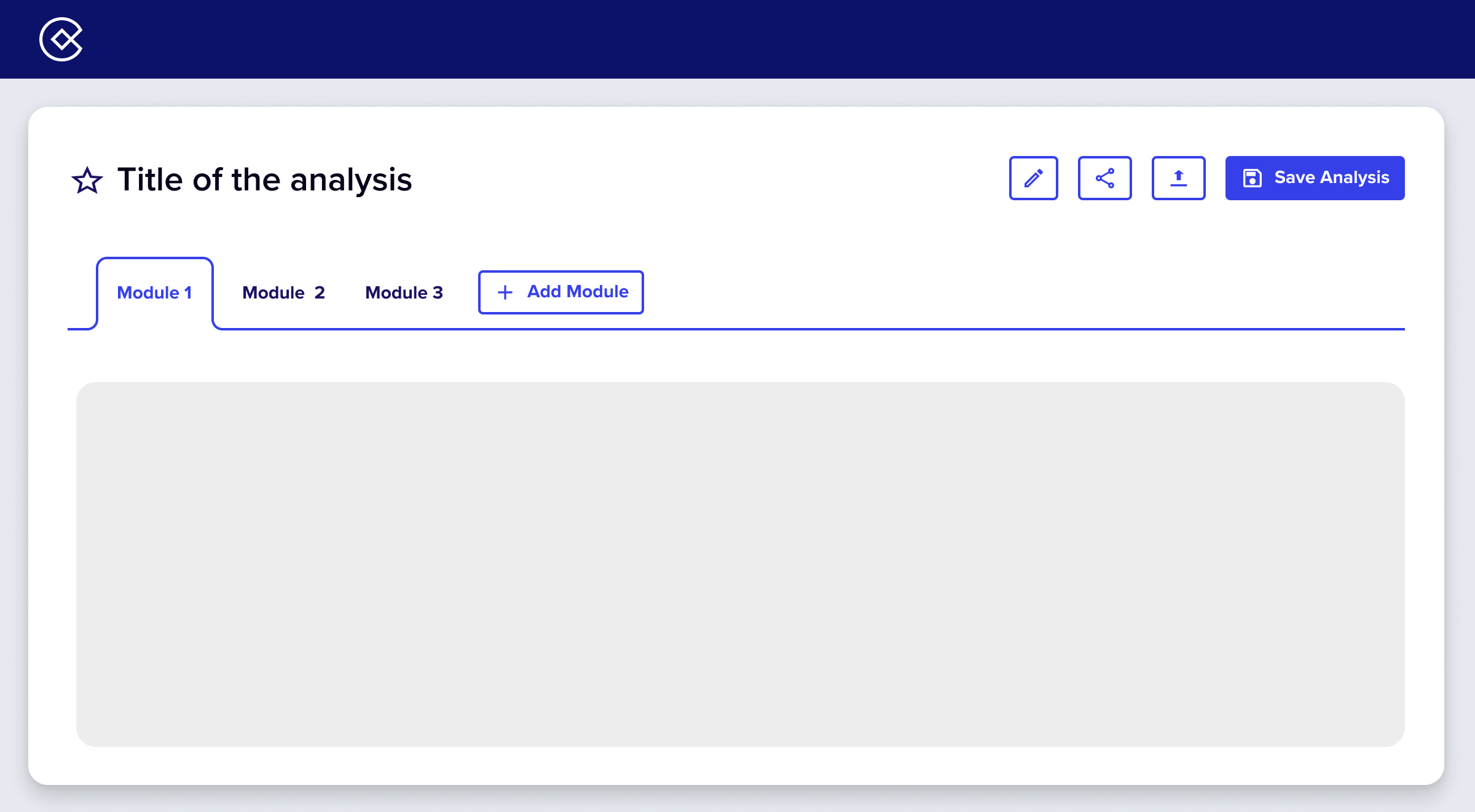
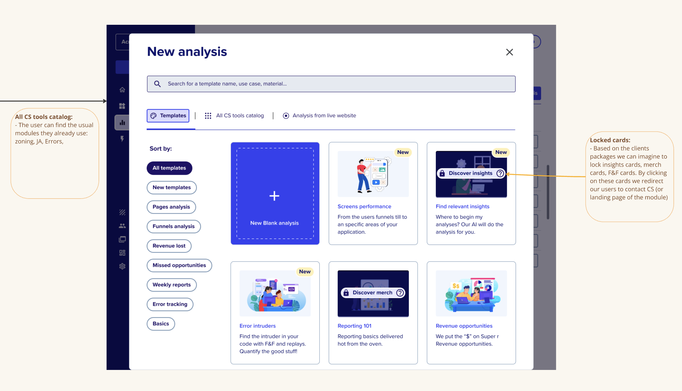
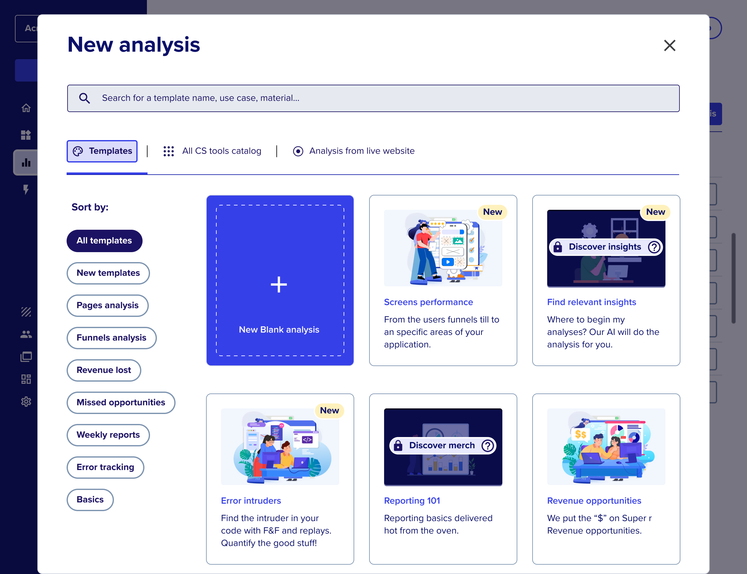
- Unified “New Analysis” hub
A single, smart creation space to start any workflow.
Combining tools enhances opportunities for template creation, AI integration, and a focus on real user journeys. This encourages our users to fully leverage the capabilities of Contentsquare.
Results
Before:
❌ Fragmented modules with no clear hierarchy ❌ Users needed to “guess” which tool to use ❌ Heavy reliance on CSM onboarding
After:
✅ Unified navigation built around user goals ✅ Simplified entry points and faster discovery ✅ Framework ready for AI-driven expansion
Impact of this project:
Even as a POC, this initiative influenced the 2023 product roadmap and became the foundation for the next generation of Contentsquare’s experience:
- Redefined “Analysis” as the core entry point
- Simplified mental models across modules
- Creation of a new unit focus on rebuilding the CS navigation
“Simplification isn’t about removing complexity → it’s about revealing structure.”

Other Projects
See Project
→
See Project
→