Heatmap full layout redesign

About this project
Feature / Tool
Zoning / Heatmap analysis
Learn more
→
Duration
3 months
Role
Lead Product Designer
Product Manager
Years
2023
The problem
Heatmap Analysis is Contentsquare’s most critical tool (used by 55% of users exclusively) allowed customers to:
→ Highlight webpage elements (e.g., <DIV>)
→ Overlay metrics (e.g., conversion rates) for insights
85%
of users only used 3 core actions due to overwhelming complexity
7/10
of users found it too complex for daily use
+50
feedback tickets cited cognitive overload
How might we simplify the interface without sacrificing scalability for future features?
Solution
H.O.R.S.E methodology: 5 step Interface Detox
H
Hide
Hide unecessary or rarely used elements
O
Organize
Organize elements to reflect a clear structure
R
Reduce
Reduce elements to only what is essential
S
Standardize
Standardize and reuse Ui patterns
E
Eliminate
Eliminate redundant or outdated elements
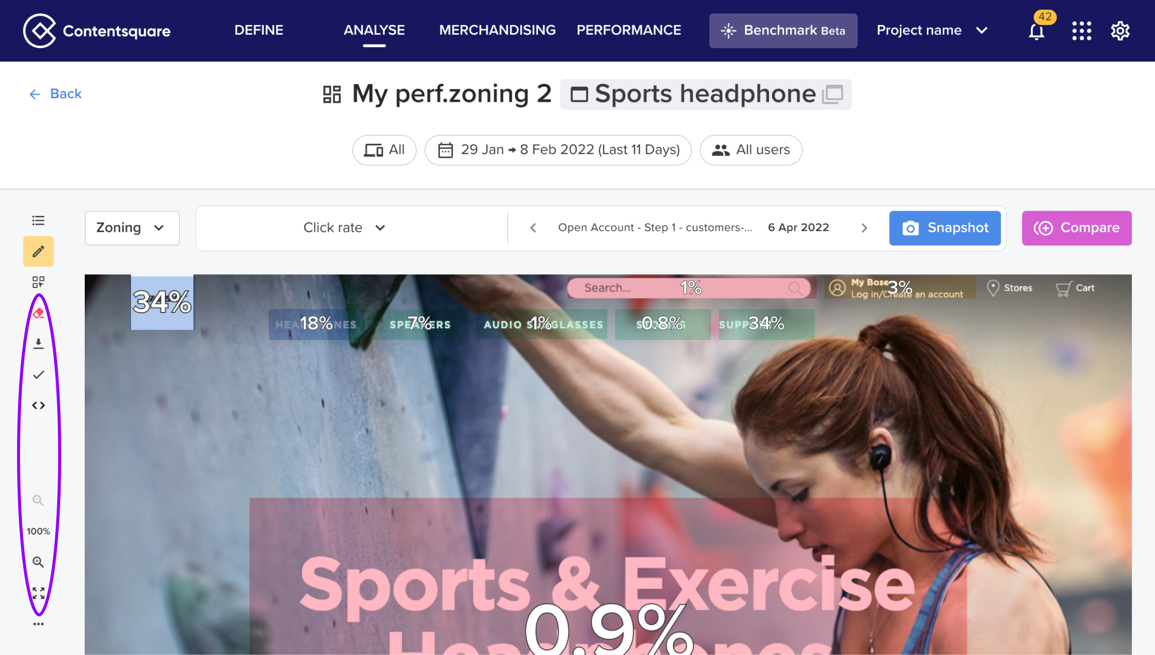
Hide
This was our starting point. After gathering some quantitative data we identified several features that were rarely used (less than 3% click rate).
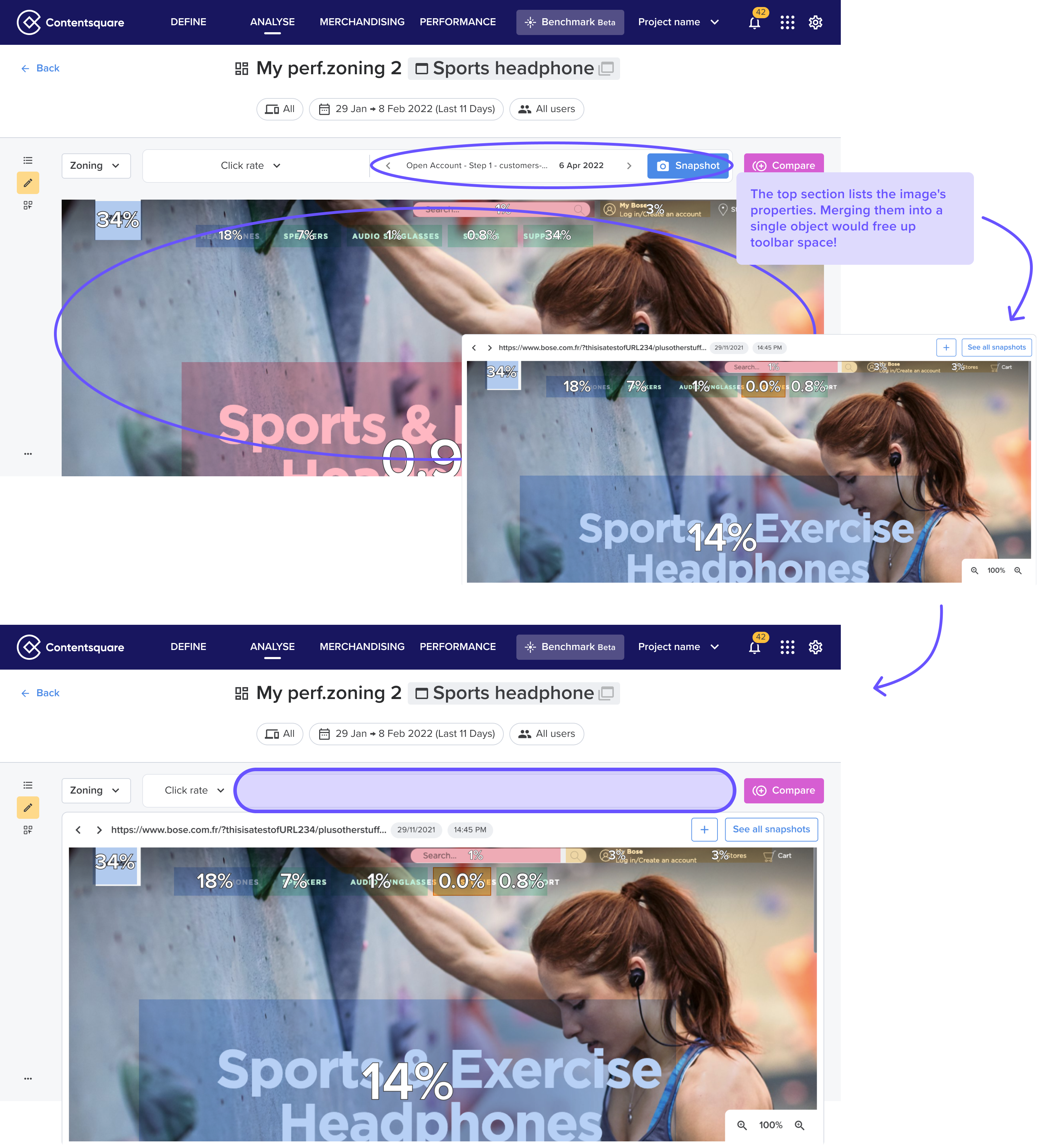
Organize
The 'L' layout increased mental effort—with few sidebar actions left, we identified an opportunity to consolidate into one toolbar.
In order to do so, we needed to reorganize the existing toolbar.
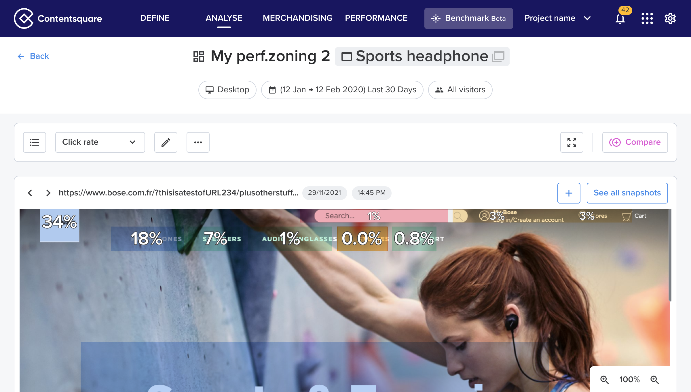
Reduce
At this stage, we prioritized key micro-interactions by making only the most essential features visible: zones list, metric selector, edit zones, full screen, and compare mode. Below is the final layout we designed.
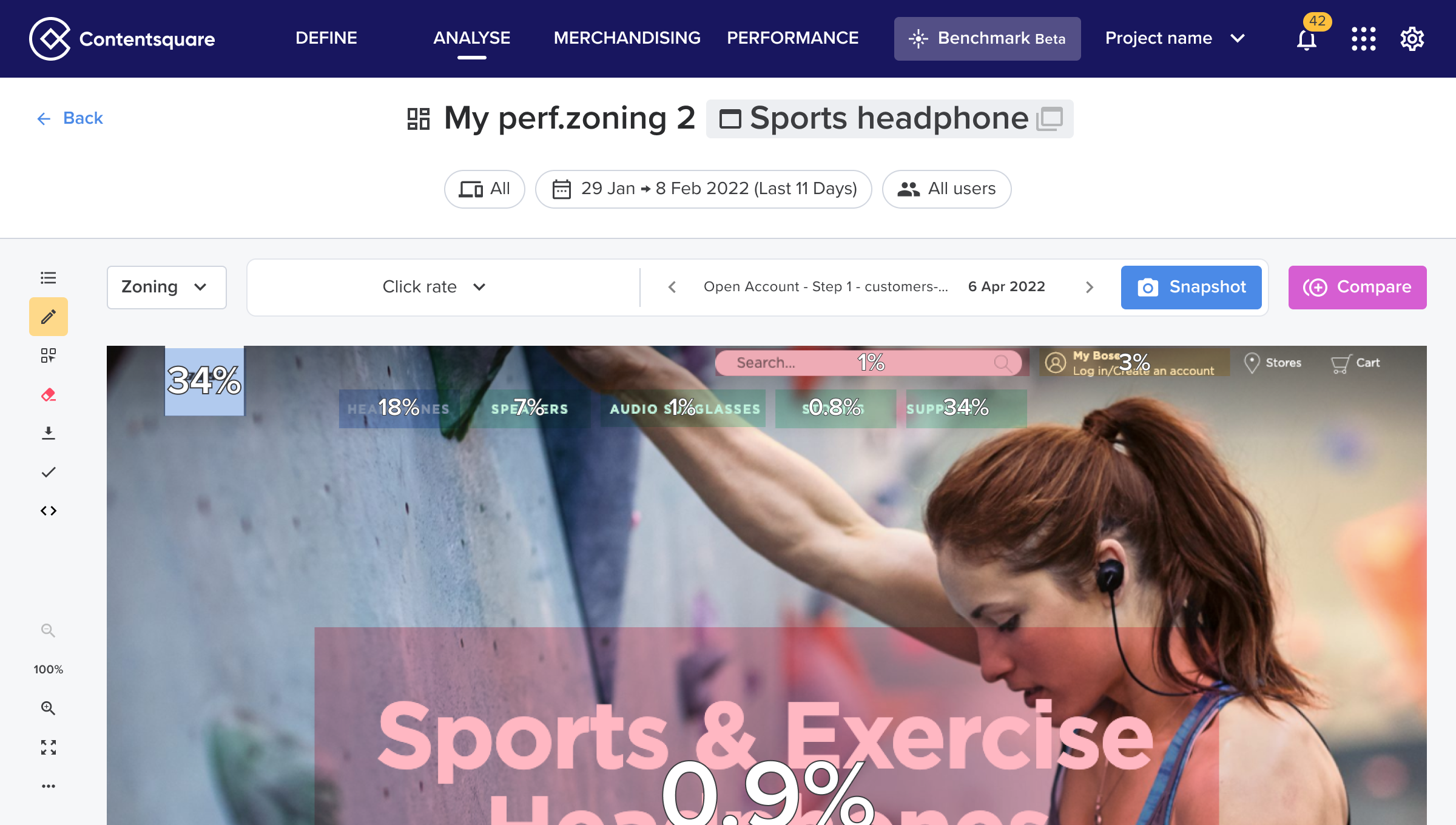
Standardize
We took the opportunity to take the toolbar as a new pattern for our design system

Eliminate
Finally we removed all components that were not part of our design system.

Results
Before:
❌ Crowded "L" layout
❌ Hard to scale
❌ Confusing actions for users.

After:
✅ Streamlined structure with a single toolbar.
✅ Simplified micro-interactions and reduced cognitive load.
✅ Future proof for new upcoming features
+12%
adoption rate for first time users
8/10
of users found the new layout “easy to use”
-66%
on feedback tickets cited cognitive overload (after 6 months)

More Contentsquare Projects

See Project
→
See Project
→
Other Projects
See Project
→
See Project
→
Heatmap full layout redesign

About this project
Feature / Tool
Zoning / Heatmap analysis
Learn more
→
Duration
3 months
Role
Lead Product Designer
Product Manager
Years
2023
The problem
Heatmap Analysis is Contentsquare’s most critical tool (used by 55% of users exclusively) allowed customers to:
→ Highlight webpage elements (e.g., <DIV>)
→ Overlay metrics (e.g., conversion rates) for insights
85%
of users only used 3 core actions due to overwhelming complexity
7/10
of users found it too complex for daily use
+50
feedback tickets cited cognitive overload
How might we simplify the interface without sacrificing scalability for future features?
Solution
H.O.R.S.E methodology: 5 step Interface Detox
H
Hide
Hide unecessary or rarely used elements
O
Organize
Organize elements to reflect a clear structure
R
Reduce
Reduce elements to only what is essential
S
Standardize
Standardize and reuse Ui patterns
E
Eliminate
Eliminate redundant or outdated elements
Hide
This was our starting point. After gathering some quantitative data we identified several features that were rarely used (less than 3% click rate).
Organize
The 'L' layout increased mental effort—with few sidebar actions left, we identified an opportunity to consolidate into one toolbar.
In order to do so, we needed to reorganize the existing toolbar.
Reduce
At this stage, we prioritized key micro-interactions by making only the most essential features visible: zones list, metric selector, edit zones, full screen, and compare mode. Below is the final layout we designed.
Standardize
We took the opportunity to take the toolbar as a new pattern for our design system
Eliminate
Finally we removed all components that were not part of our design system.
Results
Before:
❌ Crowded "L" layout
❌ Hard to scale
❌ Confusing actions for users.

After:
✅ Streamlined structure with a single toolbar.
✅ Simplified micro-interactions and reduced cognitive load.
✅ Future proof for new upcoming features
+12%
adoption rate for first time users
8/10
of users found the new layout “easy to use”
-66%
on feedback tickets cited cognitive overload (after 6 months)

More Contentsquare Projects
See Project
→
See Project
→
Other Projects
See Project
→
See Project
→
Heatmap full layout redesign

About this project
Feature / Tool
Zoning / Heatmap analysis
Learn more
→
Duration
3 months
Role
Lead Product Designer
Product Manager
Years
2023
The problem
Heatmap Analysis is Contentsquare’s most critical tool (used by 55% of users exclusively) allowed customers to:
→ Highlight webpage elements (e.g., <DIV>)
→ Overlay metrics (e.g., conversion rates) for insights
85%
of users only used 3 core actions due to overwhelming complexity
7/10
of users found it too complex for daily use
+50
feedback tickets cited cognitive overload
How might we simplify the interface without sacrificing scalability for future features?
Solution
H.O.R.S.E methodology: 5 step Interface Detox
H
Hide
Hide unecessary or rarely used elements
O
Organize
Organize elements to reflect a clear structure
R
Reduce
Reduce elements to only what is essential
S
Standardize
Standardize and reuse Ui patterns
E
Eliminate
Eliminate redundant or outdated elements
Hide
This was our starting point. After gathering some quantitative data we identified several features that were rarely used (less than 3% click rate).
Organize
The 'L' layout increased mental effort—with few sidebar actions left, we identified an opportunity to consolidate into one toolbar.
In order to do so, we needed to reorganize the existing toolbar.
Reduce
At this stage, we prioritized key micro-interactions by making only the most essential features visible: zones list, metric selector, edit zones, full screen, and compare mode. Below is the final layout we designed.
Standardize
We took the opportunity to take the toolbar as a new pattern for our design system
Eliminate
Finally we removed all components that were not part of our design system.
Results
Before:
❌ Crowded "L" layout
❌ Hard to scale
❌ Confusing actions for users.
After:
✅ Streamlined structure with a single toolbar.
✅ Simplified micro-interactions and reduced cognitive load.
✅ Future proof for new upcoming features
+12%
adoption rate for first time users
8/10
of users found the new layout “easy to use”
-66%
on feedback tickets cited cognitive overload (after 6 months)

More Contentsquare Projects
See Project
→
See Project
→
Other Projects
See Project
→
See Project
→